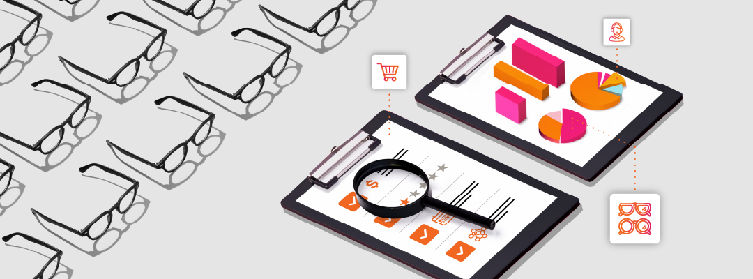
It’s no secret that in today’s digital world, there’s a high chance that your customers’ first interaction with your optical practice is likely to be online. No matter where the customer journey begins, whether that’s someone searching online or clicking an ad to land on your website, each touchpoint is an opportunity. With every step of the optician booking journey you can build awareness and trust, showcase the value your practice offers and establish what helps you stand out from your competitors.
For many practices, however, the optician booking journey is unintentionally clunky or confusing. This can lead to abandoned bookings, missed opportunities, and frustrated patients. The good news? With a few well thought out, strategic changes, your online booking process can become a seamless, intuitive and conversion-friendly experience — one that encourages more patients to schedule, show up, and return.
Why the Digital Patient Journey Matters More Than Ever
Patients now expect healthcare services, including optometry, to match the convenience they experience with online retail, food delivery, and travel booking platforms. If your practice’s website or appointment process feels outdated or difficult, users may bounce before ever reaching the booking form.
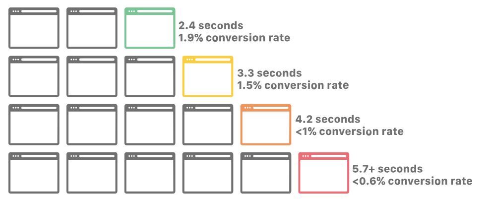
Graph illustrating website load speeds vs conversion rates. Source: Cloudfare
According to CloudFlare, a tech company specialising in website speed, a recent study showed:
- 47% of customers expect a webpage to load in 2 seconds or less
- Pages that loaded in 2.4 seconds had a 1.9% conversion rate
- At 3.3 seconds, conversion rate was 1.5%
- At 4.2 seconds, conversion rate was less than 1%
- At 5.7+ seconds, conversion rate was 0.6%
In short, investing in your digital patient journey can lead to measurable improvements in patient acquisition and retention.
Understanding the Patient Booking UX
Let’s break down the key components of a smooth patient booking UX – one that reduces friction, builds confidence, and helps patients reach the end goal: confirming their appointment.
Clear, Compelling Calls-to-Action (CTAs)
The journey begins with the first click. Your homepage, service pages, and even blog posts should include visible, consistent CTAs such as “Book an Eye Test”. These should be easy to find without scrolling and visually distinct from other page elements.
Be careful with CTAs like “Schedule Now” – while a strong CTA is essential, creating a false sense of urgency has shown that this can negatively impact conversion. Also, avoid vague wording like “Get Started”, patients are more likely to click when the action is clear.
According to sender.net, an email marketing platform:
- Clear, specific CTAs can boost conversion rates by up to 161%
- Relevant, well-placed CTAs increase revenue by an average of 83%
- The average website conversion rate is just 2.4%, but with a strong CTA, it can go up to 11.5% or more
Intuitive Booking Forms
Once a user clicks to book, they should be taken to a fast-loading, mobile-friendly booking form that’s simple and easy to complete. Key principles include:
- Asking only for essential information upfront (name, contact, preferred date/time).
- Using dropdowns or calendar pickers to streamline date selection.
- Avoiding multi-page forms wherever possible, or at least signalling progress with a visual indicator.
If your form is too long or confusing, users will abandon the process. Keep it focused and friendly.
Mobile-First Design
With most users browsing on mobile devices, responsive design is non-negotiable. This means:
- Fast-loading pages, ideally under 2 – 2.5 seconds – particularly for dynamic pages.
- Tap-friendly buttons and form fields.
- Avoiding pop-ups that obstruct content on smaller screens. Ensure that any sign-up, chat prompts or marketing pop-ups are designed for responsiveness so that they are easily closed or minimised and don’t obscure key sections of the page content.
Test your entire booking journey on different devices. What works well on desktop or tablet might be frustrating on a smartphone. Ideally, your website should be responsive as standard, optimised for mobile devices and designed specifically with applicable breakpoints for different devices in mind. When doing so, you can be sure your website will look as good on mobile devices as it does on desktop.
Personalised User Flows
Different patients have different needs, whether they’re booking a routine eye exam, a contact lens consultation, or a children’s vision screening. Make it easy for users to choose the service relevant to them, and tailor the next steps accordingly.
For example:
- Selecting “Contact Lens Consultation” could display available optometrists with that specialism.
- Choosing “Children’s Eye Test” might bring up tips about what to expect, or links to complete pre-visit paperwork.
This is something OptiCommerce offer as standard with our ‘Request an Appointment’ forms. Appointment types are configured to the client’s preference which is more efficient for opticians as it tells you the exact nature of the appointment, how you need to prepare, and how long the appointment will be when the customer is booked in. These small touches can turn a basic form into a personalised, reassuring journey.
Transparent Confirmation and Follow-Up
After a booking is made, patients want reassurance. Confirmation emails or SMS messages should include:
- The appointment date and time
- The practice location and contact details
- Any forms they should complete in advance
- How to cancel or reschedule, if needed
Even better? Send friendly reminders 24 hours and 2 hours before the appointment. These not only improve show-up rates but also help reduce admin workload for your staff.
Auditing Your Online Journey: Where to Start
If you’re unsure how your current online journey for opticians is performing, walk through it yourself. Try booking an appointment from both desktop and mobile. Take note of:
- How long it takes to complete
- How many clicks are involved
- Whether anything feels confusing or off-putting
You might be surprised how many unnecessary steps are in place, or how many opportunities there are to make things clearer.
Consider involving a few patients or colleagues to do the same. Their feedback can be invaluable in spotting gaps or misunderstandings.
Enhancing Your Digital Patient Journey
It’s a well-known fact that the more actions or decisions a user has to take to get their end destination, be that booking an appointment, or buying prescription glasses online the more this will potentially damage conversion rates (link to definition) and increase the potential risk of the user abandoning their initial activity.
Your overall aim should be to reduce the number of decisions and action the user needs to make to get where they want to be (and where you want them to be too). Once you’ve identified friction points, here are a few ways to improve:
1. Reduce Steps
Can you complete the appointment booking action in three steps instead of five? Removing just one page or field can make a big difference.
2. Speed Up Load Times
Compress images, streamline plugins, and work with your developer to optimise page speed — especially on mobile.
3. Automate Where Possible
- Use automated SMS or email confirmations and reminders.
- Pre-fill form fields for returning patients.
- Sync your booking system with your diary to prevent double bookings
4. Monitor and Adjust
Track metrics like:
- Booking form abandonment rates
- Conversion rates by device
- Average time from landing on site to completing a booking
Test small changes and monitor what works. The digital landscape changes quickly, and so should your strategy.
Ready to Improve Your Booking Journey?
Creating a seamless optician booking journey is one of the most impactful changes you can make to your practice’s digital presence. It improves patient satisfaction, boosts appointment volume, and reinforces your professionalism.
At OptiCommerce, we help eyecare providers of all sizes create high-converting online booking experiences — from UX / UI design to implementation, training and support.
Final Thoughts
The path from click to booking is no longer a “nice to have” — it’s essential. As patients become more digitally savvy, their expectations rise. A seamless, intuitive, and mobile-friendly digital patient journey ensures that those expectations are not only met, but exceeded.
With the right tools and a little guidance, you can turn your website into your practice’s most powerful booking tool.
Not sure where to start? Let us walk through your digital patient journey and provide a no-obligation report on where improvements can be made.